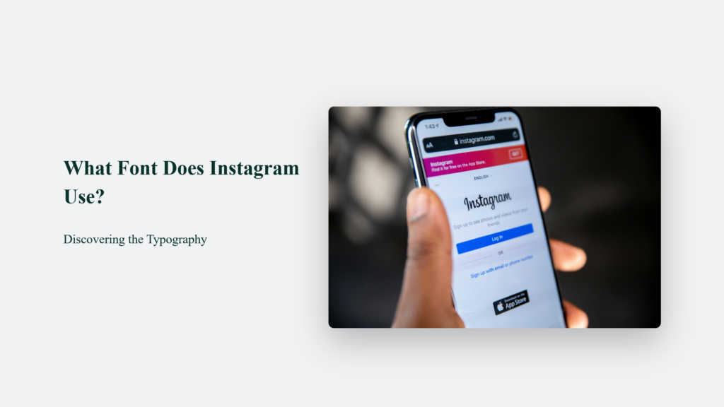
When we think about Instagram, we often picture the endless scroll of vibrant photos and engaging videos. But have you ever stopped to consider the font that wraps around these visuals, subtly shaping your experience? As it turns out, Instagram’s font choice is not just a random pick from a hat but a carefully curated aspect of its brand identity. So the question is, what font does Instagram use? Let’s find out.

What Font Does Instagram Use: The Journey from Billabong to Instagram Sans
Once upon a time, Instagram’s logo was etched in a font called Billabong, reflecting a youthful and dynamic vibe. However, as the platform evolved, so did its typographic choices.

Enter Instagram Sans, a custom typeface developed in collaboration with Dalton Maag. This font, with its unique “squircle” design (a blend of a square and a circle), is a nod to Instagram’s global and inclusive vision. This change marked a significant shift in how Instagram presented itself, moving from a playful to a more sophisticated and future-focused brand identity.
The Core Fonts: Proxima Nova, Neue Helvetica, and San Francisco
On the web, Instagram uses Proxima Nova for its text. This sans-serif typeface, known for its modern and clean lines, enhances readability and adds a contemporary touch to the Instagram experience. Regarding mobile devices, the fonts diverge based on the operating system. Android users see Roboto, praised for its clarity, while iOS users are greeted with San Francisco, known for its optimal readability across Apple devices.
Expressing Creativity with Stories and Reels
The Role of Custom Fonts in Storytelling
- Aveny-T for Modern Aesthetics: Aveny-T is a popular choice in Instagram Stories for users aiming for a modern and sophisticated look. This font’s clean and streamlined appearance resonates well with contemporary content, be it fashion, technology, or lifestyle-themed Stories.
- Cosmopolitan for Neon Flair: The Cosmopolitan font brings a neon-like quality, perfect for more vibrant and energetic content. This font is often used in nightlife, music, or festive-themed Stories, providing a dynamic and lively visual appeal.
Enhancing User Engagement
- Personalization: These fonts allow users to tailor their content to their unique style and personality. Whether it’s a serene, minimalist aesthetic with Aveny-T or a more vibrant vibe with Cosmopolitan, users can align their Stories and Reels with their personal brand.
- Storytelling: The font choice can significantly influence the storytelling aspect of content. A well-chosen font can underscore the narrative, be it a poignant personal story, a business promotion, or a comedic skit.
Impact on Audience Interaction
- Visual Appeal: Custom fonts can make content stand out in a sea of Stories and Reels. This visual distinctiveness captures attention and retains it, leading to higher engagement rates.
- Brand Identity: For businesses and influencers, consistent use of specific fonts can become part of their brand identity on Instagram. This consistency aids in brand recognition and recall among followers.
Technical Flexibility
- Versatility: The range of fonts available caters to various content types and moods, from serious and informational to playful and whimsical.
- Accessibility: These fonts are designed to be legible and visually appealing across different devices, ensuring a seamless experience for all viewers.
Cultural and Artistic Expression
- Cultural Representations: Fonts like Cosmopolitan can evoke certain cultural themes or celebrations, adding depth and context to the content.
- Artistic Freedom: The diverse font options give users the artistic freedom to experiment with typography in their digital storytelling, pushing the boundaries of traditional social media content.
The Technical Side of Instagram’s Typography:
Instagram’s approach to typography is a masterclass in balancing aesthetics, functionality, and user accessibility. Rather than just being a visual flourish, the fonts used on Instagram play a crucial role in shaping the user experience, reinforcing brand identity, and ensuring the platform remains user-friendly and accessible to a diverse global audience.
Aesthetics and Brand Identity
Instagram’s font choices are deeply intertwined with its brand identity. The shift from Billabong to more modern fonts like Proxima Nova and the introduction of custom fonts like Instagram Sans marks a significant evolution in the platform’s aesthetic.
This evolution mirrors Instagram’s growth from a photo-sharing app to a global social media powerhouse. Each font choice, whether the contemporary feel of Proxima Nova or the bespoke characteristics of Instagram Sans, contributes to a coherent visual identity that resonates with users worldwide.
Functionality: Readability Across Devices
One of the key functional aspects of Instagram’s typography is its focus on readability. The platform is accessed on various devices, from large desktop monitors to small smartphone screens, so it requires fonts that are legible in different sizes and resolutions. For instance, Proxima Nova is chosen for its clean lines and modern appearance, enhancing the website’s readability.
In contrast, using San Francisco for iOS and Roboto for Android devices is a strategic choice that aligns with the native system fonts of these operating systems. This ensures that text is easy to read and looks natural within the app’s interface.
User Accessibility: Inclusive Design
Instagram’s typographic choices also reflect a commitment to accessibility and inclusivity. The fonts are selected not only for their aesthetic appeal but also for their clarity and ease of reading. It is particularly important for users with visual impairments or those using the platform in varying light conditions.
The legibility of fonts like Proxima Nova, San Francisco, and Roboto ensures that text in posts, captions, and profiles is understandable to as wide an audience as possible, making the platform more inclusive.
Technical Considerations: Performance and Compatibility
From a technical standpoint, Instagram’s font choices must balance performance with compatibility across different platforms and devices. The fonts must be lightweight enough not to slow down the app yet robust enough to support a wide range of characters and languages. This is particularly challenging given Instagram’s global user base. Using system fonts like Roboto and San Francisco helps in this regard, as these fonts are optimized for performance on their respective platforms.
Customization and Personal Expression
Instagram users often seek to differentiate their profiles using custom fonts despite the standard fonts. It is where third-party apps and online font generators come into play, offering a buffet of styles for bios, captions, and more. The idea is to maintain a consistent aesthetic while allowing room for personal flair.
The Role of Fonts in Instagram’s Brand Story
Every font on Instagram tells a part of its brand story. From the sleek minimalism of Proxima Nova to the user-friendly Roboto and the readable San Francisco, each font plays a role in crafting a harmonious and engaging user experience. They’re not just letters on a screen but silent narrators of Instagram’s visual tale.
Frequently Asked Questions:
What’s the main font used on Instagram?
Can I personalize my Instagram font?
Does Instagram offer different fonts for Stories?
Indeed, it does! Instagram Stories features a variety of fonts, from the modern Aveny-T to the neon-like Cosmopolitan, providing users with creative freedom to express their style
The Bottom Line:
In conclusion, the fonts on Instagram are more than just a design element; they are an integral part of the user experience, reflecting the platform’s brand identity and evolution. So, next time you’re scrolling through Instagram, take a moment to appreciate typography’s subtle yet impactful role in shaping your social media journey.


